Hello!I'm Paulina
My journey in the world of design started in 2018. Since then, I've been on an exciting quest to craft innovative, user-centered solutions that make a difference. My work is driven by the belief that exceptional design can have a profound impact on the way people interact with technology, whether it's a logo, a website, or any digital interface.
I'm passionate about bringing creativity to life through design, and I'm committed to helping my clients achieve their digital goals. Unique layouts, interactions, and great typography are what I focus on when working on my projects. In addition to design, I have experience in IT and project management.
Overlay design
RelentlessNinja
- Theme:
- Dark ninja aesthetic with Japanese-inspired elements
- Color Palette:
- Deep purple, black, and neon violet accents
- Mood:
- Mysterious, intense, competitive
The design incorporates:
- A stylized ninja mascot logo as the focal point
- A torii gate silhouette and mountain landscape for atmospheric depth
- Cherry blossom branches for subtle cultural detailing
- Glow accents and gradients for a modern esports feel
The purple-dominant palette enhances brand recognition while ensuring white text remains highly legible.
Ragontor
- Theme:
- Jungle-inspired competitive overlay with a wild mascot identity
- Color Palette:
- Deep forest greens, lime highlights, black, and warm yellow accents
- Mood:
- Fierce, energetic, adventurous
The design incorporates:
- A bold gorilla mascot logo placed centrally to dominate the composition
- Layered jungle silhouettes with trees and monkeys to create depth and atmosphere
- Soft gradient transitions that add dimension without clutter
- Banana-shaped UI accents that reinforce the theme in a playful but cohesive way
- Clean, rounded social media panels aligned symmetrically for balance
- A strong yet minimal webcam frame with subtle green highlights
The green-dominant palette builds a fresh but intense identity, while yellow accents draw attention to key elements. High-contrast typography ensures readability, and dark framing keeps the overall layout structured and stream-focused.
FishScale
- Theme:
- Competitive red streaming identity with strong architectural influence
- Color Palette:
- Bold red gradients, deep black, and sharp white contrast
- Mood:
- Energetic, confident, high-impact
The design incorporates:
- A centrally placed circular logo that immediately captures attention
- Symmetrical temple silhouettes creating structure and depth
- Subtle textured background to add intensity
- Clean decorative corner details framing each layout
- Strong, angular webcam frame for a modern esports look
- Minimal, compact alert boxes for clear on-stream information
The dominant red palette enhances visibility and emotional intensity, while white typography ensures strong readability. Black framing elements balance the composition and keep the overall layout clean and professional.
Background design
Neon city scene
A stylized night cityscape illustrating a contemporary urban business environment. The composition uses deep navy and violet tones, illuminated windows, subtle neon accents, and rain reflections to create depth and a cinematic yet controlled atmosphere.
- Layered skyscraper silhouettes to emphasize scale and modernity
- Soft light gradients and window patterns to suggest activity within the buildings
- Reflections on wet pavement to enhance realism and visual depth
Nordic landscape
A stylized Nordic seascape depicting a dramatic Viking expedition beneath a storm-lit sky. The composition uses deep navy and icy blue tones, layered fjord silhouettes, and a powerful lightning strike to create depth and a cinematic, high-impact atmosphere.
- Viking longship silhouettes to emphasize scale and narrative focus
- Soft gradient transitions across mountains and sky to enhance depth
- Water reflections to reinforce mood and visual balance
- Strong central lightning bolt to introduce energy and tension
Twilight nature landscape
A stylized sunset mountain landscape illustrating a calm, atmospheric natural environment. The composition uses soft violet, mauve, and warm peach tones, layered hills, and a low-setting sun to create depth and a serene, cinematic mood.
- Layered mountain silhouettes to enhance perspective and spatial depth
- Smooth gradient sky transitions to convey a tranquil evening atmosphere
- Tree and foreground framing elements to guide the viewer’s focus
- Subtle bird silhouettes to introduce motion and life
Web design
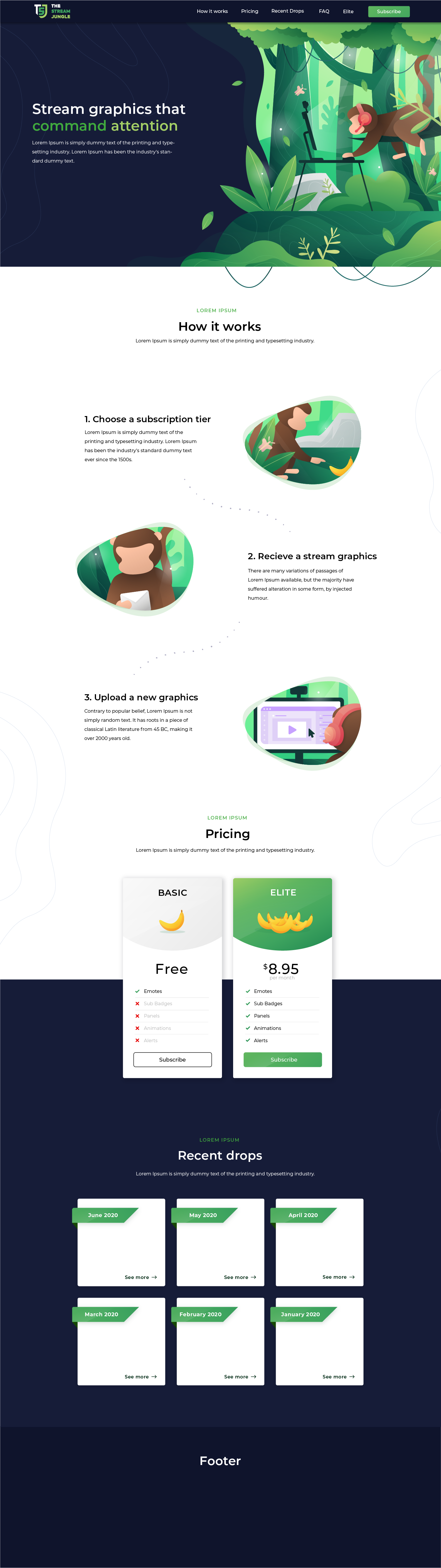
The Stream Jungle
Landing page for a stream graphics subscription—focused on a clear offer, quick explanation, and plan choice.
Case study
Communicate the value instantly, explain the 3-step process, and drive users to select a subscription tier.
Key highlights
- High-contrast hero with illustration and strong headline
- Step-by-step “How it works” to remove friction
- Pricing cards with a highlighted recommended plan
- “Recent drops” grid to reinforce ongoing value
Sections
Hero · How it works (3 steps) · Pricing · Recent drops · Footer
Visual style
Friendly illustrated theme with jungle motifs · Strong whitespace + large headings for readability · Green accents for CTAs and primary buttons
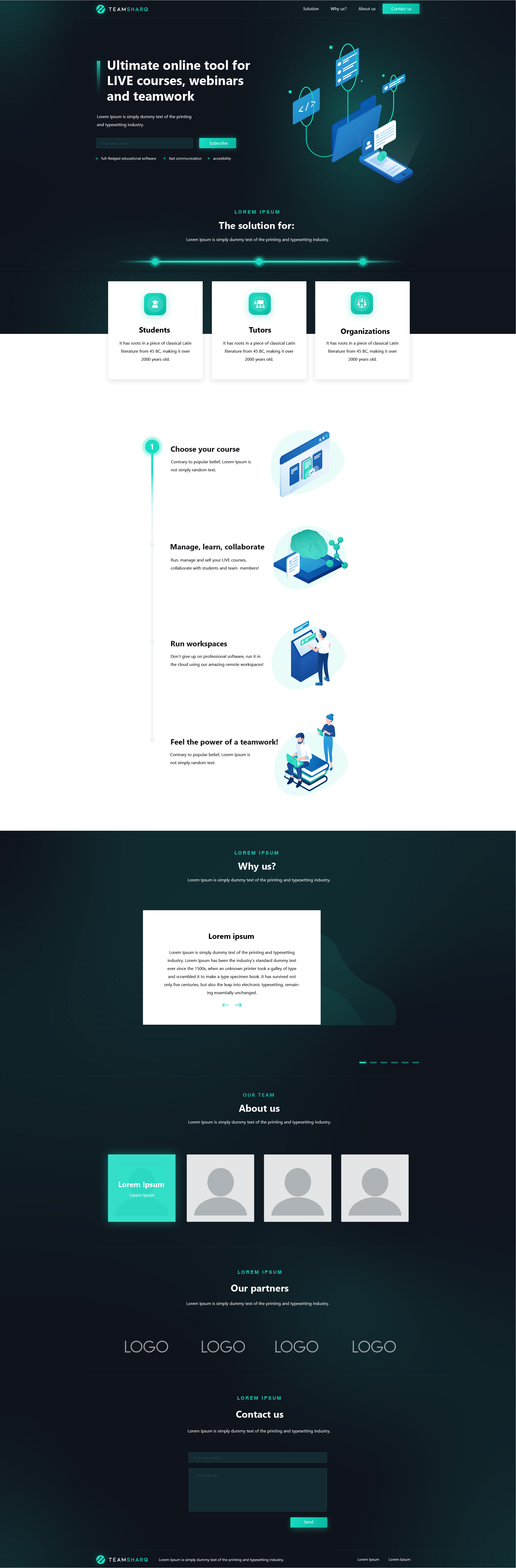
TeamSharq
Marketing page for an online platform (live courses, webinars, and teamwork) with clear sectioning and trust cues.
Case study
Introduce the product in one screen, then guide users through benefits, trust-building blocks, and a contact CTA.
Key highlights
- Premium dark hero with a focused headline and primary CTA
- Feature cards for fast scanning above the fold
- Clear narrative: benefits → proof → team → partners → contact
- Consistent turquoise accent for actions and emphasis
Sections
Hero + CTA · Feature cards · Benefits / workflow · Why us (testimonial) · About us (team) · Partners · Contact
Visual style
Dark gradient backgrounds with soft glow · Card-based layout with clean iconography and spacing · Light sections as readability breaks
Emblem design
Trooper emblem
A sci-fi inspired emblem built around a strong circular insignia and a cool, minimal color palette. The design is optimized for community branding, profile avatars, and headers, using bold outlines and simplified shading to maintain clarity and recognizability.
- Theme:
- Futuristic military badge inspired by Star Wars
- Color Palette:
- Cool steel blue background, light gray armor tones, strong black outlines
- Mood:
- Authoritative, tactical, iconic
The design incorporates:
- A front-facing armored trooper helmet inspired by the recognizable galactic soldier style
- Perfect symmetry to emphasize discipline and structured power
- Subtle blaster silhouette element enhancing the sci-fi combat narrative
Shadow Omens
A monochrome emblem for a sci fi style brand. Built around a bold astronaut silhouette and thick outlines so it stays readable on merch, stickers, and small digital avatars, with strong contrast for dark UI backgrounds.
- Theme:
- Minimal sci-fi insignia with strong emblematic presence
- Color Palette:
- Cool blue background, soft gray armor tones, bold black contour lines
- Mood:
- Tactical, iconic, controlled
The design incorporates:
- A front-facing armored helmet simplified into bold geometric shapes
- Circular badge framing to enhance logo compactness and versatility
Nordic pathfinder
An outdoors inspired badge combining compass arrows with a central tree and mountain base. Designed as a clean, flat system for patches, labels, and brand stamps, with simple shapes that hold up at small sizes.
- Theme:
- Minimal outdoor badge with Nordic wilderness identity
- Color Palette:
- Warm beige base, deep brown outlines, forest green accent
- Mood:
- Rustic, grounded, adventurous
The design incorporates:
- A central evergreen tree symbolizing nature, resilience, and exploration
- Crossed arrow elements forming a balanced, directional composition
Logo design
H3P Wellness
The symbol merges a citrus slice with an abstract human figure to visually express the connection between nature and personal wellbeing. The dynamic upward gesture suggests vitality, growth, and positive energy. A fresh lime green tone highlights health and renewal, while the earthy brown adds balance and a grounded, organic feel. The circular structure reinforces harmony and continuity, core values within wellness branding. The clean, minimal vector execution ensures strong scalability and clarity across packaging, digital media, and print applications.
Bas
A minimalist wordmark built around soft, rounded typography that communicates simplicity and modernity. The smooth curves and balanced spacing create a friendly yet refined visual tone. The subtle custom details inside the letterforms add character without disrupting readability, giving the mark a distinctive but clean identity. The muted gray palette enhances versatility and keeps the brand feeling contemporary and understated.
Aaron Bassett
A signature-style logo combining expressive script typography with subtle vintage badge elements. The handwritten “Bassett” creates personality and approachability, while the small uppercase “Aaron” adds structure and hierarchy. The thin geometric frame and star accents introduce a retro-inspired detail, giving the mark a handcrafted yet professional character. A muted coral outline paired with dark gray lettering balances warmth and sophistication.
You can verify it yourself
Olivia Hayes
Kamil Wojcik
Sarah Coleman
Dariusz Zielinski
Marta Nowak
Alex Turner
James Whitaker
Olivia Hayes
Kamil Wojcik
Let's work together
If you're looking for a distinctive website, a strong visual identity, or a logo that truly represents your brand, feel free to get in touch!
contact@paulinakozera.com